Logo

Convert More Traffic with these 4 UX Tips.

UX and Creative, Ecommerce Strategy

When we think of improving performance marketing, the majority of brands will more than likely think about acquiring larger quantities of traffic. And whilst that is still very much important, having huge amounts of traffic landing on your site is wasted if your website is not optimised to convert that traffic.

We've compiled 4 of the most simple and efficient ways you can optimise your site's UX to help generate more revenue from your current audience.

  • Checkout

  • Categories

  • Product Description Pages

  • Social Proof

Checkout Process


When discussing UX and CRO with brands, the first part of the website I will always check is the flow of the checkout process. Optimising this can often reap the biggest rewards as your consumers are already ready to purchase, they just need a smooth journey to complete that purchase. The easier you can make the checkout, the more likely the consumer is to complete the entire journey. Place any obstacles in their way and you are increasing the likelihood of them abandoning the purchase altogether.

Break the checkout journey into multiple stages and add breaks where it makes sense.


There is nothing more off putting than being greeted with one big form to fill out; especially on a mobile. So divide your checkout process into different stages and have them lead from one to the next. The logical journey we often see is

  1. Basket confirmation.

  2. Select delivery option and enter delivery information (address, contact info etc).

  3. Payment. Multiple payment options like Paypal, Klarna etc should be available as well as option to add promotional codes.

  4. Overview page with final CTA to place order.

  5.  Confirmation of order with estimated date of delivery.


Provide more than one payment and delivery option.


Providing choice is your biggest ally when it comes to checkout. If you are only offering consumers the option of entering credit card details, you are missing an entire audience who may only purchase on mobile through Apple/Google Pay. For luxury purchases or purchases of a higher product value, you might wish to think about offering Buy Now, Pay Later options, such as Klarna, ClearPay or Paypal Pay in 3.

Delivery options need to be clear and should be towards the beginning of your checkout process so that consumers are not hit with a large delivery fee at the end of the journey. Transparency is key. Clearly stating which delivery or shipping options are available for their location and the associated costs is best. Studies have shown that offering a free delivery option can help improve conversion rate, even if it takes a little longer.

AutoFill.


Consumers are lazy and we've already established that we want to make this process as simple and quick as possible. One surefire way of achieving this is ensuring that you have autofill capabilities embedded within your checkout form fields. Of course, if someone is registered and signed in onto your website it is expected that their information will automatically populate across the site as standard. Make sure that this is also an option for any consumers checking out as guest. If they have saved email addresses or postcodes to their browsers from previous purchases, you can add html to your forms to prompt them to use this data.


Categories.


Properly categorising your products is an easy way to ensure that your website visitors can find what they are looking for. This may mean that your navigation and secondary navigation is a little larger than what you had envisioned from a design perspective but it's far more important that consumers can browse your site with ease and find everything that they are looking for.

This example from Burberry is a great showcase of how to carefully categorise across their entire women's collection.

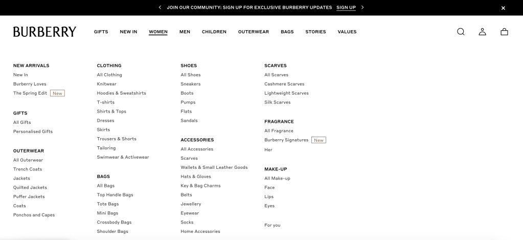
It doesn't need to be complicated. It needs to be clear. There is no point making all your categories names of collections as consumers newer to your brand won't know what they're looking for.


Product Description Pages.


Once your consumers have found what they might be looking for through your clear navigation system, you need to ensure that your product pages are also optimised to convert. Now this doesn't mean that you need lots of sales copy plastered all over the page. You can make some simple adjustments to what you already have present to make sure you are set up in the best way for success.

Product imagery.


This should go without saying but your product imagery needs to be high quality; whether that be static images or videos. I'd recommend a mixture of the two, especially for fashion, so that consumers are able watch video to see how the product hangs or moves when being worn. A diverse group of models should be used and if appropriate show clothing on a range of body types. For products such as luggage, home goods or furniture, 360 degree views work well or an option to see the product in AR.

Product description.


Use bullet points and accordion modules to house all your relevant product information. Again, you want to be clear and concise. Alongside a description of your item, you may wish to include

  • Sizing/product dimensions

  • Specific product features

  • Material

  • Delivery Options

  • Reviews

This example page from Fairfax & Favour shows a great blend of imagery and video and a neat way of displaying all product information that is still in keeping with the identity of the brand and style of the website.


Social Proof.


Social proof can come in many forms. The easiest way to provide these trust signals is through customer reviews and having them displayed on your product description pages. Collecting reviews can sometimes be tricky but having personalised email strategies optimised to encourage or incentivise reviews often works best.

There are also some more innovative methods of social proof coming into the market. Website plugins and tags from providers such as Fomo or Flockr allow brands to show realtime purchases or updates specific to parameters such as products or locations over a certain time period.

Seeing popups stating "30 purchased in the last 24hours" is great social proof that your products are worth purchasing.


The above 4 tips are not complex. But they may just be things that are slipping through the net when it comes to your website strategy. Before you enhance your acquisition strategy to improve traffic levels, ensure that you website is set up for success.


Looking for

Support?

If you or your brand are looking for support with a particular service or have a question about what you've just read, get in touch and we'll be happy to help!

Looking for

Support?

If you or your brand are looking for support with a particular service or have a question about what you've just read, get in touch and we'll be happy to help!